Introduction.
I spent my time being with the nature and think how beautiful the nature is. I love how the nature look and being alive, I love spending my time going outside and looking at the nature around me. I love how peaceful it is, it makes me feel calm and less stress. I would like to go to a beach, forest, road trip somewhere like in countryside; green area and an area where it is about to get dark. People take photos of nature because they love the way the nature look and how beautiful it is. Yes, photographs can help us change the way we see things because photography is a powerful medium for capturing and conveying emotions, stories and perspective.
When I hear ' landscape' I see in my mind of being in different area with natures in different seasons like summer.
Words i do associate with landscape:
- Nature.
- Mountains.
- valleys.
- fields.
- Rivers.
- beauty.
- Colours.
- Sunsets.
- Wildlife.
- Scenery.
I see pictures of landscapes in Google of different places like country sides, road trip and mountains. The colour fades and blends together, the angle of the shots are in different places. The reflection on the lakes looks too realistic that it looks like it's been photoshopped.
My ideal landscapes would be naturalistic beauty. Because I really love how the nature looks, and places such as mountains, lakes, forest, countrysides, with warm colours in the sky and in different seasons.
When I look outside my bedroom window, I see many buildings, and cars outside, the sky with a colour of blue and the clouds moving slowly and the sun is almost down giving the sky the colour of orange yellow and red-ish.
Yes, I do take landscape sometimes outside my house, the parks, fields, or just anywhere I go, the landscape pictures I took is in every seasons and in places like Oxleas Wood. I take pictures of landscapes because I love taking pictures of nature and the way it looks.
Landscapes.


In this homework, I had to find many good areas to take landscapes and also I had to make sure to the right lightening so I don't mess up my pictures. I had to think outside the box where to take the photos because I always take photos outside my house all the time so i decided to take photos on the street, up the hill and parks like football field.
The idea of landscapes.


These landscapes both seems old. The on on the left is only of an actual landscape. The one on the right is a landscape but it also has a man riding a horse. Both landscapes are taken from a POV angle. Its basically an angle from which is taken at eye level. Both are taken from where the average human would see it standing up. In both images we are fairly close to the landscapes. This may have been done on purpose to make the viewer feel like they are actually in the photograph. The image on the right has been cut off, most probably from another, bigger image. After some more research, the image on the right has been cut off from an existing image that was an ad. This is interesting because its exploring the boundries of 'stealing' others people work.
Back to the Future.


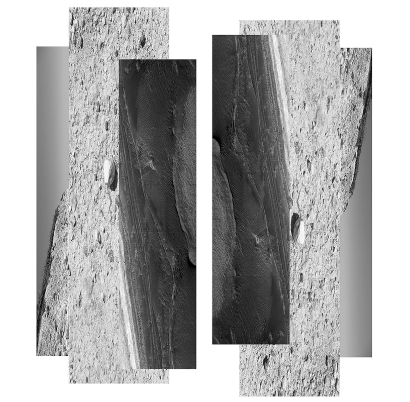
They describe landscape as in back in time or past. The images are considered as they are landscape constructed. They are appear to be the same because they both have more than two landscapes mixed with each other to make up one whole picture. one seems to be richer in colour with represent on the environment itself, whereas the other shows a collage of unclear locations with cracks. Gustave Le Gray landscape give calming and peaceful and observant. Dafna Talmor landscape gives random and shaky. If i had to choose which landscape I want to live, I want to live in Gustave Le Gray landscape but it seem like it represent peace and no problems.
The two piece of writing about research of Gustave Le Gray and Dafna Talmor landscape help us understand that taking these negative photograms are really hard to take so they take two negative and collaged them together on a single paper.
The photograph on the right side, looks more destroyed and it is complicated to understand what it is and what it represent, however if you look at it more and be patient you will start to see it is landscape of a sea and beach. This photograph looks more like it is been burnt. In my opinion, it represent the destruction of nature such as beach.
Centre of British photography.


On this trip, we visited a Centre of British Photography exhibition. All the photos were displayed on a plain, simple white wall and the frame is the same colour as the wall. I think the way they displayed the photos is nice and simple and I like how it is just one or two colours like the frame is black and the wall is all white which expresses the the way the photos show. I also like how they show books of photos in a see-through box and use different ways to show photos, for example, books and papers of photos and a box with a photo on the top.
The lighting makes the photos look better since there are lights for each individual photo. I like the way they display the photos in different ways like photo on the glass, frames, books, leaflets and papers.
Some photos show a nature and diversity, I really like the photos of nature where it is taken many exposures on single negative to capture in a single image. It look like it been painted because it been combined with so many exposures.
Mitra Tabrizian: The Silence of Numbers.


In this photo, it look like it has two photos but actually, it is an upside-down photo and a person with a dog is walking normally on the field making it look like it has two photos. This photo was taken because our planet have simultaneously neglected and exploited. We reel from the consequences: pandemic, pollution, climate change and war. I really like this photo because it makes me think about the nature and the city, like the half of nature and half of city. When I read what the photographer wrote the meaning of the photo, it touched my heart that the meaning is touching, it also inspires me to look at the nature and how beautiful it is and I don't want the beauty to go away and destroyed.
Minimalist landscape.
Geraldo de Barros's photo is a tree cut off and the background is all plain black just like the emptiness, the outline of the tree is all white. Liz Nielsen' photo is a copy of a landscape but black outline of the bushes, buildings and floor, the photo is really simple, however it is really hard to see what it is since it is less detail. I find unusual about Geraldo de Barros's photo because it just a tree and a plain black on the background which me confuse what is the meaning of the photo. I find surprising about Liz Nielzen's photo because it look like a random piece of object but really it is a landscape just only the outline and the shade of it.
When I look at both these photos, it makes me think that how nature is destined to grow and develop regardless of the environment. I would to take pictures of field for a simple landscape and cut the outlines and the shades of the field, trees and bushes. For Geraldo's photos, I would take a photo of any tree, however I would take a photo of a tree with no leaves only branches so it will be easier. I think that Geraldo removed the bottom part of the landscape because it isolates the understanding of where the photograph is located. Liz's photos, the different parts of the image have been recreated with a cut-out technique to obscure what the viewer. can see. I prefer Liz Nielson work because it is more like it controls what you see and limits the landscape.
When I look at both these photos, it makes me think that how nature is destined to grow and develop regardless of the environment. I would to take pictures of field for a simple landscape and cut the outlines and the shades of the field, trees and bushes. For Geraldo's photos, I would take a photo of any tree, however I would take a photo of a tree with no leaves only branches so it will be easier. I think that Geraldo removed the bottom part of the landscape because it isolates the understanding of where the photograph is located. Liz's photos, the different parts of the image have been recreated with a cut-out technique to obscure what the viewer. can see. I prefer Liz Nielson work because it is more like it controls what you see and limits the landscape.
Photogram experience evaluation / Liz Nielson's recreation.


In this photogram experience, it is a recreate of Liz Nielson's work, I took a photo of landscape of fields, trees, bushes and mountains only simple stuffs not like cities building something that are too detail. I cut the outlines and the shades of the images and stick it on the plain white paper so I can do the photogram properly without any mistakes. When I finished making my work, I printed the same thing but on the acetate which is for photogram, then I went to the dark room where you make the photogram, I copied the acetate on the specific paper which took 5 and 6 seconds for two tests. I put into three chemicals tray exactly 5 and 6 seconds which shows the photos but which different exposure and colours than the normal photo and it will be different since it took 5 and 6 seconds on each paper which will look different. I clean them in the water for a while and dry them removing the water and hanging them. I also did a enlargement which is a full photo so I did the same thing.
|
In this photograph, I see a landscape of mountains and sea, however the photograph had been destroyed, which makes it complicated to see and understand what is in the photo, also there are limited things you can see in this photograph which makes it hard to understand about the photo, but you can see some things in the photo, such as mountains, sea, forest and rocks. In these photos, the aspect of the photos got removed or destroyed to focus on the main point, such the importance of nature, mountains and rivers.
In my opinion, it looks like the photographer is showing that the nature is getting destroyed time by time, that we would not notice before the time where it would get worse. |
Uta Barth: Out of Focus Photographs.
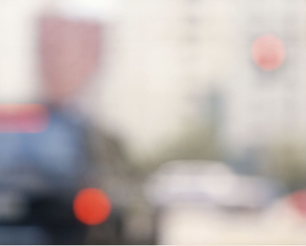
In this photograph, I see a car on the front, with a red light glowing, in the background you can see more cars and buildings including a red one. Uta Barth photographs are out of focus, because of this, the photo looks like it have different shapes, making the image more abstract. If I was to describe this photo to a blind person I would say the photo is out of focus, there are many cars in the background and buildings and structure. The red light from the back of the car are glowing, however because the photo is out of focus, everything look like shapes and confusing when you look at it the first time. This photo is abstract image since it is out of focus so the photo are just random shapes. I recognise a car on the front of the photo and a buildin in the background. The background full with cars and a red building seem new to me because I didn't know what it is at first because you need focus on it.
The camera position are the ground like eye level since it is not low level or high level. The angle of view is normal. The orientation of this photo is portrait. The tone of this photo is full colour however it is blurry so there are mixed colours. Composition in this photo is not arranged since it is blurry so the frame is like mixed together. The style of the photo is informal since it is like destroyed.
The anomalies in the photo is a red building in the background, it look off because it does not match with other buildings since it is different colour, also it feels odd with a red building in the photo because it look like it been ruined. The edges in the background looks unrealistic because you don't what it is and you can't explain what, the car also look unrealistic in the background it look like a different subject. The position of photographer is consistent with image content. No, this photograph could not have been taken in the circumstances, because it is a photo being out of focus since it is nothing to do with a event happening.
This photograph is a out of focus since it is blurry. It shows a car on the front and cars in the background, a red light glowing and buildings/structures in background as well. The photo was taken in 1995 and it taken at a random street. Uta Barth took this photo. Uta Barth took this photo because to create images that destabilise the viewer's expectation of a photograph. This photo effect the viewers' expectations about this image. The photo confirm my knowledge by knowing what is in the out of focus image and letting my expectations come. No, it is not reliable or relevant as historical evidence.
Out of Focus Experiment.


Evaluation.
In this experiment, I took photos of out of focus, a recreation of Uta Barth's work. I use my phone to take this photos to do this, you go into your camera app, put your hand or finger on front of the camera but not on the camera, like little far from the camera. You press and hold on the camera until you see AE/AF lock on top of your screen then it the camera becomes blurry.
I took some photos inside a school building and i will take some outside the school building and outside school. I want to take photos of a street maybe with some cars in the background or empty road, I also want to take the photo in the dark.
The camera position are the eye level and high level to make it look like it is humanoid. By doing this it is showing a sense of commonality and makes the image easy for the viewer to observe. The angle of the view are normal, but I face the camera looking up. The orientation of the photos I took are landscapes and portraits. The tone of photos are full colours.
Out of Focus Photographs


In this experiment, I took photos of out of focus, a recreation of Uta Barth's work. I use my phone to take this photos. To do this, you go into your camera app, put your hand or finger on front of the camera but not on the camera, like little far from the camera. You press and hold on the camera until you see AE/AF lock on top of your screen then it the camera becomes blurry
I took some outside the school building and outside school. I took photos of a street with some cars in the background or empty road, I also want to take the photo in the dark.
The camera position are the eye level and high level to make it look like it is humanoid. By doing this it is showing a sense of commonality and makes the image easy for the viewer to observe. The angle of the view are normal, but I face the camera looking up. The orientation of the photos I took are landscapes and portraits. The tone of photos are full colours and the exposure are bright.
Dafna Talmor: Constructed landscape.
|
Dafna Talmor:
Dafna Talmor's work are about that she is interested in the notion of a utopian space that it does not exist but somehow rooted in the reality. Her attitude to her photograph work that she is so focus to make no mistakes and check if her framing is correct to make her photography pieces. She takes her time making her work. Dafna Talmor uses specific equipments such as microscope to to look her framing if it is in the correct frame and make sure if the photo is together. |
|
Gustav Le Gray: Constructed Landscape:


In this photographs, taken by Gustav Le Gray, it look like it were taken from a old, vintage type of camera to make the photos more like nostalgia and peaceful. There are nothing much in the photos but it have no fill of colour, however it does not look like black and white, it looked like it had been edited to change the contrast, the highlights, the exposure and the vibrancy of the photos.
The photos look very simplistic and minimalist, which makes the photos look calm and not complicated. The photos are mostly nature and buildings, the photographer only take random photos, but not just like any random photos, the photographer only take photos in specific places to make you feel and think about the nostalgic time you had in the past or childhood.
The photos look very simplistic and minimalist, which makes the photos look calm and not complicated. The photos are mostly nature and buildings, the photographer only take random photos, but not just like any random photos, the photographer only take photos in specific places to make you feel and think about the nostalgic time you had in the past or childhood.
Dafna Talmor's project recreation experiment.


Evaluation.
my set of this experiment, I used blurry photos from my previous photoshoot, I put coloured acetate over them and also scratched into them. I also added clear sellotape to add more texture. I made some simple and some hard acetate and i also made a mix of them.
I like the acetate with many scratches on buildings, tress and road, and also with a blue colour acetate because it have random shapes and scratches on specific areas in the photo which it makes it more unique.
WWW: I scratched the acetate and add colour acetate on it to make it look like a ruined place or dimension.
EBI: I need to frame the acetate more better and think twice before I do something or ruin the acetate. I need to use the sellotape more carefully since I kept messing up the tapes.
Digital collage homework.


Here, I have to take 15 photos of general areas and 15 photos of specific areas in the general photos. I took 15 photos in Greenwich Park as in general and I took 15 photos that is specific in general photos. I also took photos in the dark which is contrasted from daylight. I mostly took photos in the day time and night time where the light is which shows the areas and the landscape photo.
I like the photos in the dark with the light in which shows peace, relaxing and calm mood from the photos. The photos make me feel calm and it gets rid of things that are busy from my mind.
I like the photos in the dark with the light in which shows peace, relaxing and calm mood from the photos. The photos make me feel calm and it gets rid of things that are busy from my mind.
Dionne Lee 's constructed landscape review .
In this video, Dionne Lee have many photos of constructed landscape and she place them on top of each other and rip them into pieces, cut them out and fold them, then she does it again. At the start of the video, it is very confusing what she is doing because she does not explain what she is doing and how she is doing. She just place random photo on top of each other and the photos into pieces. However, during the video, I start to understand she is making multiple collages with different photos and same photos. The video is very relaxing as you can hear
However, some people dislike this video because it is very odd and boring since there is no music and Dionne wasn't speaking/talking about the collages which makes its boring and confusing.
However, some people dislike this video because it is very odd and boring since there is no music and Dionne wasn't speaking/talking about the collages which makes its boring and confusing.
Dionne Lee's constructed landscape respond.
Mindmap.
Artist research:
| |
Brea Souders


In this photographs, Brea Souders took photos of nature, such as mountains. He also added his shadow in these photos, being included in nature. Brea took these photos because of the human dream of experiencing the landmarks of a beautiful natural world. He tends to take photos of nature and add the shadow of himself, which represents humans. All of this shows a human enjoying the beauty of nature in the world, seeing how beautiful it is, and achieving their dreams of discovering and exploring the nature of the world.
The camera positions are at eye level; however, the camera is facing down on the ground. For example, in some photos, Brea faces the camera down on the ground, where he can see the shadow, and he takes it at different places. However, in some photos, he took photos of mountains while his camera was facing down, showing everything, such as trees, many mountains further away, and a river, which extends the meaning of these photos. The tone of the photographs is full colour, but the shadow looks odd because it looks too black.
The camera positions are at eye level; however, the camera is facing down on the ground. For example, in some photos, Brea faces the camera down on the ground, where he can see the shadow, and he takes it at different places. However, in some photos, he took photos of mountains while his camera was facing down, showing everything, such as trees, many mountains further away, and a river, which extends the meaning of these photos. The tone of the photographs is full colour, but the shadow looks odd because it looks too black.
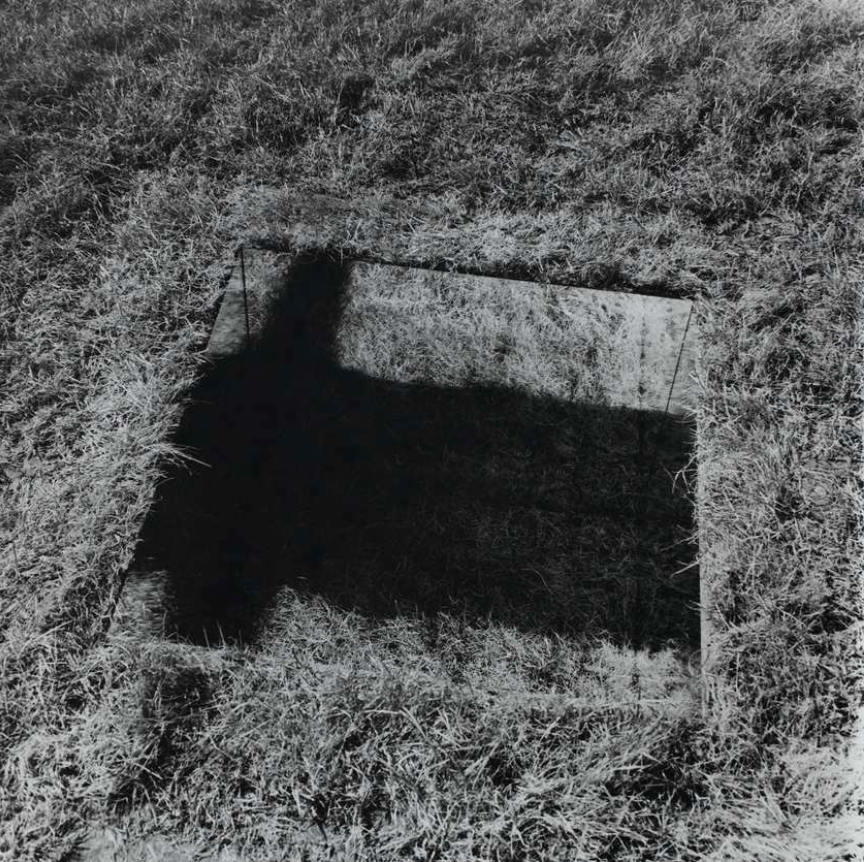
Keith Arnatt.


In this photographs, Keith Arnatt took photos in the nature with just only one prop which is a mirror. He took these photos because he look at how beauty the nature are and when he found about photography he started taking photos of the nature with just simple things, like props.
In those photos, there are mirrors in it, obviously, but in the mirrors, there are shadows and maybe another photo which is edited on the mirror, so a photo overlaying on a specific area which makes it really interesting because it shows how really simple it is.
In this photographs, the camera position are eye levels, however it most likely facing on the ground since it shows the nature and it gives a lot of spaces for nature to fit in the frame of the photos. The orientation of the photos are landscapes so it can give us a better view of the places in the photographs. The tone of the photographs are some of the photos are full colour however it looks like it been taken from old, vintage style camera for example, in some photos it look like it have low contrasts and bad quality, however it doesn't affect the performance of the photos because it makes the photos more interesting. On the other hand, in some photos, the tone are monochrome which makes the photos black and white but the brightness are quite high but some photos have bad quality as well.
Analysing Keith Arnatt's photo.
|
In this photograph, I see a square looking-mirror on the grass. The artist, who is Keith Arnatt make it really simple and not complicated which is easier to understand the meaning behind the photo. I would describe this photo as minimalist since in this photo there are not much anything except only one prop which is a mirror. However, we don't know if the square thing is a mirror or is edited, because if you think about it, if is it a mirror with a prop hanging behind the camera or it is edited to put the photo on the square. This photo could either be naturalistic or abstract because I don't know if it is been edited or not edited, so it is between natural and abstract, however, in the photo the background is nature.
|
Mandy William


Mandy Williams.
Analysing Mandy William's photo.
|
In this photograph, I see three different photos being cropped and added together, however this artist edit the photo, makes it look more complicated and it hard to see and understand what it is. But, the more you look at it, the more you will understand. I would describe this photo as complicated. This photo is an abstract image, as Mandy chose three photos and cropped them out and rearranged them.
The artist does not need any equipment for this, instead the artist edited the photos, however to get the photo, you need equipment to take photos in order to edit. The photos are black and white, monochrome, but the contrast and the brightness level are quite high which makes the photo to show more and simple. The shapes of the photos are rectangle and the patterns are the same. This interest me the most because it is very complicated and hard to know what the photo is, but start to know about it later. The photograph look very unique. |
Photographs inspired by artists or photographers.
Photos inspired by Keith Arnatt


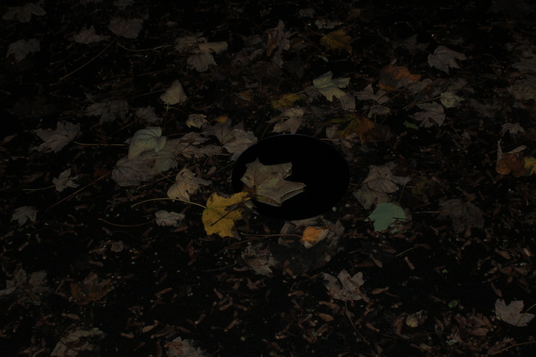

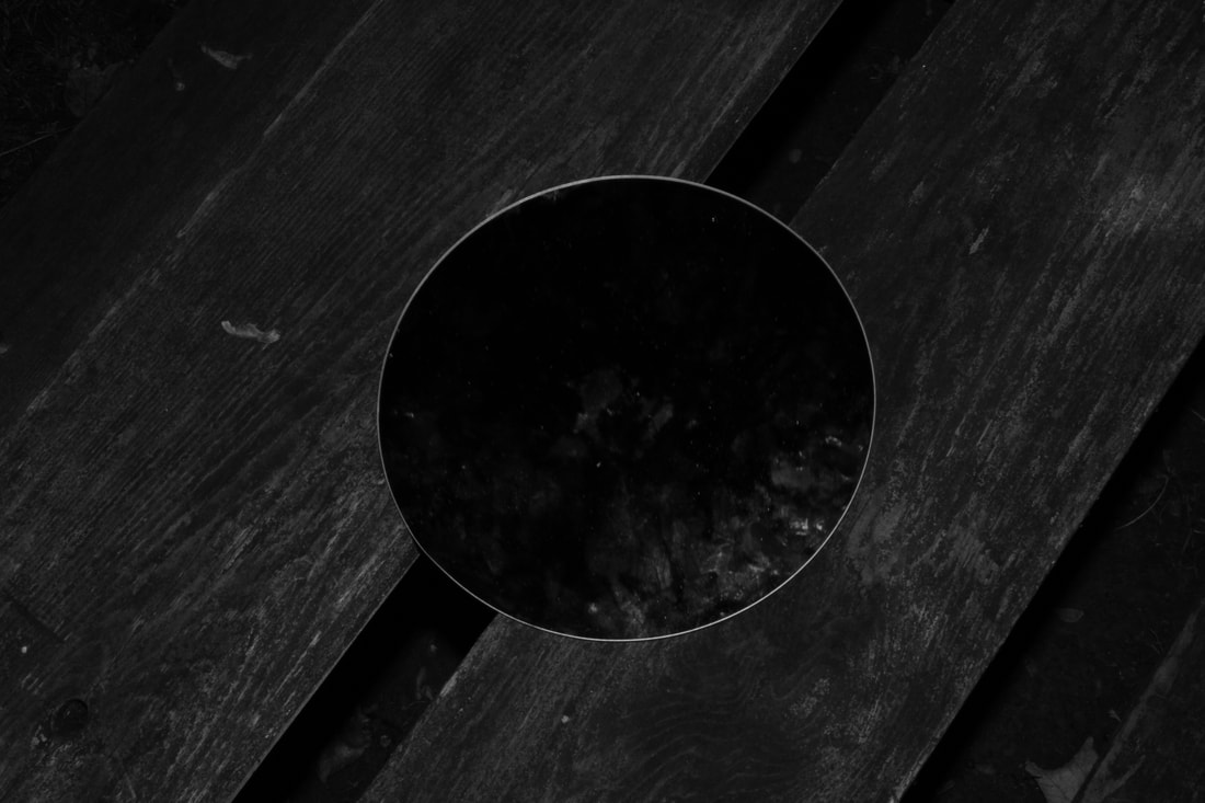


In this homework task, I took 30 photos inspired by one of the artists or photographers i had chosen to research, which Keith Arnatt. In all of my photos, I only use one prop which is a circle mirror, I used this prop because the artist, Keith Arnatt, used mirrors the nature as a background which shows the nature and it also shows peace.
The photos I took to respond the artist photographs, the similarities are we use the same prop and uses leaves, grass and sticks to show/tell us that the nature is included. I placed the mirror on the floor and I also added leaves and stick to include nature. I also placed mirror on sign and trees. I took photos in normal tone where everything are full colours and some photos are monochrome which are black and white.
The differences between my photos and the artist, Keith Arnatt, are I only took it in the dark, night time and keith took his photos in the midday.
Photos inspired by Mandy Williams.


In these photographs, I only edited some photos to make a collage with different photos. These photos were inspired by Mandy Williams. I chose three or two different photos and edited them together. I used photos from different places and at different times; for example, in some photos, I took photos of the town in the daytime and some photos of the street at night. I used the Photoshop Express app on my phone to edit these photos, which helped me a lot because it gave me more ideas for which photos to edit and which to choose.
In these photos, the similarities between my photos and Mandy Williams's photos are that we used two or three different photos in one collage. The photos are separated a little from each other to give each photo space and let them show the photos and the meaning behind them.
The differences between the photos I took and Mandy William's photographs are that she took photos in black and white (monochrome), whereas on the other hand, my photos are full colour, which shows the old-time photo style and the modern-time style. Also, she used some editing to make it separate and moved around the photos like she was playing with them, making the photos look more unique. While taking my photos, mine were more like almost full frames of photos. I don't give spaces for each photo, which is disadvantageous to showing the photos.
Mandy William's response refining:


In these photographs, I refined my work inspired by Mandy William. I took different photos of the nature and the opposite of it, for example, cities, roads and shops.
In my refining photographs, I am pleased that I used different ways to edit my photos and took photos of specific areas such as nature. I like the way I add spaces for each photos in one frame which makes it look more simple and unique. I also like I used some ideas from the artist i chose, who is Mandy William, for example, in some photos I add some lines around the photos making it look more distinctive. I am also pleased with the way I edited the photos in different shapes to make it interesting rather than using the same shapes, making it look more boring.
However, the next time I do this experiment again, I need to take more photos to make it easier to choose rather than use the photos again and again. Also I need to change the colour and the tone of the photos, for example changing the colour the photos to black and white, monochrome, to make it more fascinating. For editing, I should use Photoshop or Photopea for better editing than using PS Express on my phone which gives me hard to edit. Photopea helps me to edit more and gives me many choices to edit. I also have to take my time and be patient with editing my photos because sometimes i rush to edit and it end up blurry without knowing it, so next time I will take my time.
Editing : Refining my first experiment.


In my first experiment, I used an app called PS Express on my phone, which is a really good editing app. In this refining experiment, I took some different photos It took a lot of time to edit because the photos had to be precise. I like the way I can do many things easier as the app shows me many tips and little help to make photos look better. I can also edit really quickly free-hand and faster than doing it on a computer since it takes a lot of time to edit using keyboard and mouse.
I had to screenshot every time because I have to pay for the premium to edit more and better, this cause me to rush and I was not patient since it took a lot of time and it is hard to edit since there are less choice and cuts my ideas to edit the photos the way I wanted.
I had to screenshot every time because I have to pay for the premium to edit more and better, this cause me to rush and I was not patient since it took a lot of time and it is hard to edit since there are less choice and cuts my ideas to edit the photos the way I wanted.
Final first experiment:
First test:
|
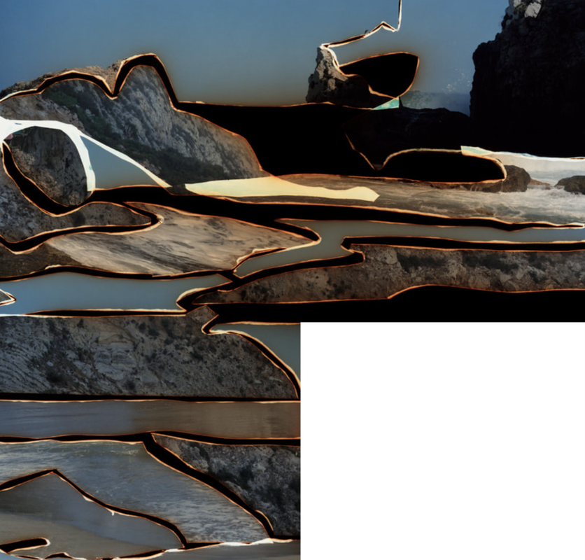
In my final experiment first test, I used the same photos as last time to make sure if it goes well then I will continue using the same way of editing. As you can see in this photo, I used Photoshop on my computer instead of using Photoshop Express on my phone. In this photo, I changed the tone of the colour of the photos to black and white, monochrome, which I said I would change the colour in the previous experiment.
The differences between a computer and phones are, few pros and cons are using a computer. On the computer, there are different varies to edit your edits, which opens a lot of choices so I don't have to stuck to less choices. However, on the other hand, the cons are it takes a lot of time to edit my photos, as I need to learn how to edit because on the computer it is more complicated to edit. To improve: I need to use a landscape background, since I used portrait, which causes to lack space around the frame for the photos. I need to take more photos for this final experiment. Overall, it is good to edit on the computer which I will continue to use Photoshop for the second test or maybe the final experiment. |
First test editing POV.
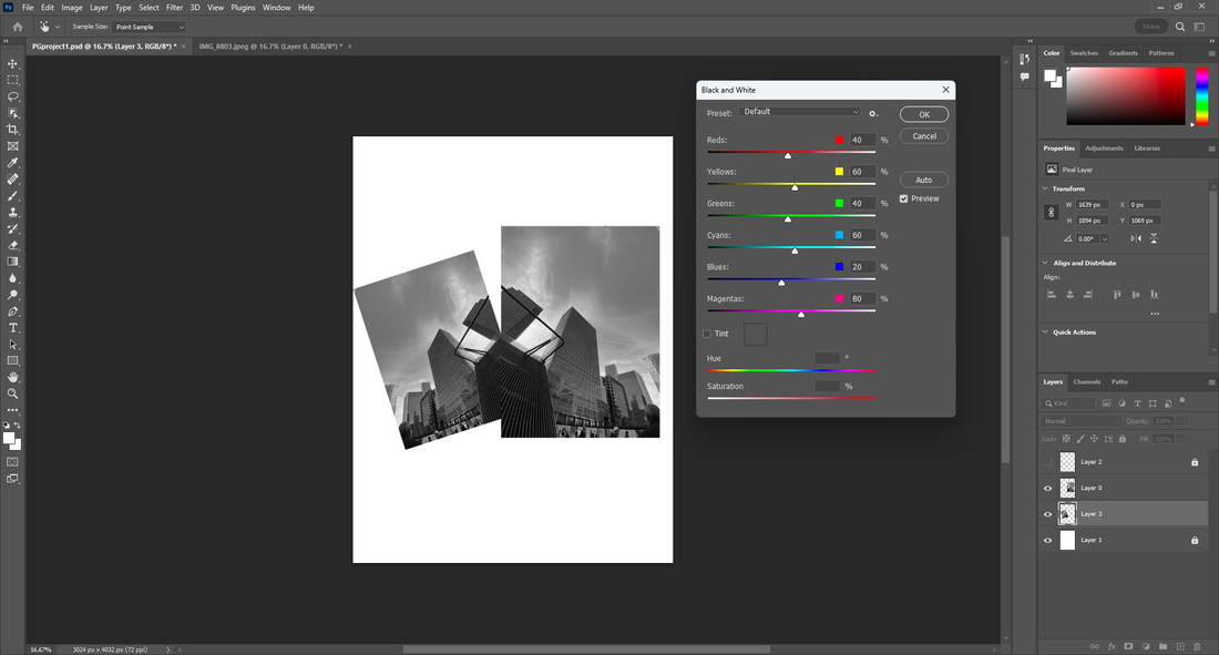
In my first test edit, I used Photoshop to edit my photos. As you can see here, I added more layers for each specific photo and background. I order the layers in a specific order so it won't mess up the edit, because if I didn't order the layers, each layer will be mixed up and you won't be able to see the photos. I did this because I don't want to put all of the photos and background in one because it will be very complicated and confusing which photos to edit, and it will mix all of them.
On the top right corner, you will see the 'Transform' title, and at the bottom of it, there are angles 'W' (width) and 'H' (height). I used these to change the position and the size of the photos. It took a lot of time to get at the precise angle, accurate number, so it makes it look more unique.
To improve:
I need to use a landscape background, since this project is Constructed Landscape, and it also gives a lot of the spaces around the frame for the photos so it doesn't look crowded and squished, which can ruin the aspect of the photos.
I need to think more ideas to edit the photo in different way instead using the same one which makes it boring and uninterested.
I need to take more photos to edit for the next test so it can give me more ideas to edit and make it look how I want to.
I also need to learn to edit more so it can give me more choices and open more doors for me to edit.
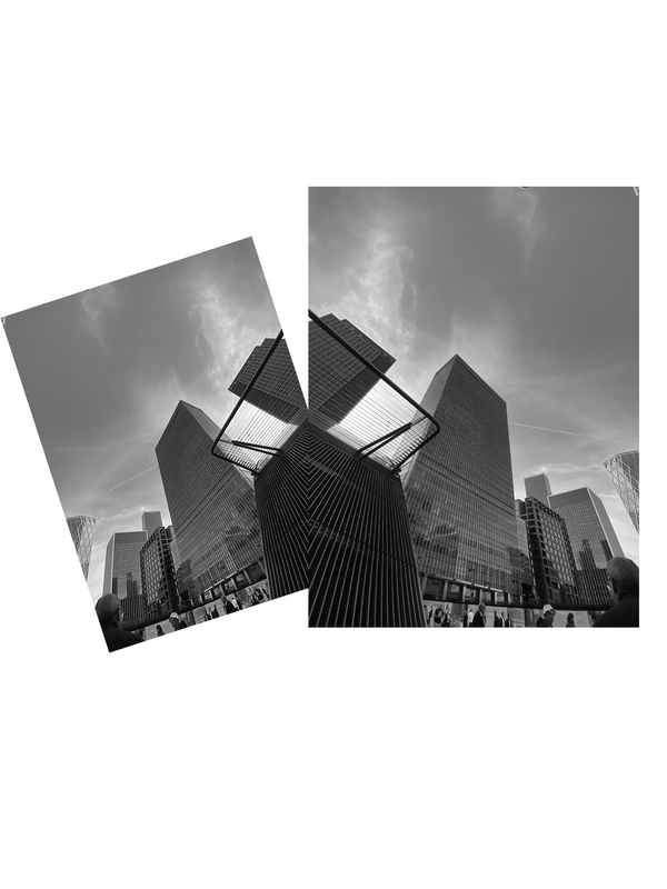
Last Refining My Work Inspired by Mandy William:


In this photograph, I did a second test editing using different photo this time. I used a similar idea that the artist I am inspired by from Mandy Williams. This idea helps me to edit different ways. I used the same editing app, photoshop, this helps a lot to edit and gives me more ideas. As you can see in this photo, I took different photos of a building and i used the same photos but i cropped it differently to make it more unique and complicated.
The reason why I took this photo because the building represent the economy of London and the modern infrastructure the city is building. It also shows how busy London as many people go to work 24/7 non stop.
The reason why I took this photo because the building represent the economy of London and the modern infrastructure the city is building. It also shows how busy London as many people go to work 24/7 non stop.
Second Test editing POV:
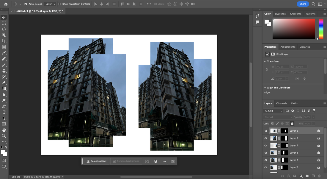
This is the POV of me editing the photos, which is shown above. I used photoshop to help edit my photos.


Experiments: Plans
My experimental plan is do different experiment such as slides, taking videos and many other I think off.
Maybe make a book for photos I edited for my first experiment. If not then i will make a display with photos i edited.
Maybe make a book for photos I edited for my first experiment. If not then i will make a display with photos i edited.
